

1. Learn how to use z-index properly
The z-index property can be extremely useful when utilized properly. Unfortunately, a lot of developers and designers alike do not seem to fully understand how z-index works. As a consequence, you often can find code with an extremely high z-index and one with a very low z-index, showing the designers frustration to get it working properly.
The secret to using z-index properly, is positioning. Z-index must have some kind of positioning applied to it to function properly. This means setting the positions of the element(s) to either relative or absolute.
Check out the where can I learn more section below for some great links and screencasts on z-index.
How can it help?
Quite simply, it can help by providing the functionality it was meant to, layer objects/elements in a specific order. Chris Coyier gives an excellent screencast (link below) where he uses a badge on a demo website. The problem is, he wants the badge behind the paragraph text. Chris uses z-index and the position property to solve this issue.
Where can I learn more?
Glad you asked! Below are some great resource for learning about z-index and how it functions and relates to web design.
- CSS-Tricks Screencast: How z-index works.
- W3 Schools: Z-index property.
- Live Demo: How to use z-index.
2. Backgrounds and shorthands
The background property is one of the most frequently used properties of the CSS spec. It allows us to separate content images from design images, or images that make up the page layout. The background property also contains quite a bit of options, which over time can really start to take up some space in your CSS file.
One option often overlooked is the shorthand method for the background property. The background isn't the only property you can declare via 'shorthand', you can do this on quite a few properties, such as font. Let's look at an example of background shorthand below:
		#element{
			background:transparent url('bg_img.png') no-repeat scroll top left;
			}
With the one line of CSS above we have knocked out 5 different background properties! This can really save you a lot of time. The order for the background property shorthand is as follows:
- background-color
- background-image
- background-repeat
- background-attachment
- background-position
How can it help?
The CSS shorthand method can help with any property that accepts a shorthand method by reducing the code you are required to write. In my opinion, the shorthand is still just as readable as independently declared statements, as they are placed in a logical and sound order.
Where can I learn more?
3. Take advantage of CSS3...responsibly
The CSS3 draft and suggested standards have really opened up a whole new world to developers and designers. Rounded corners, gradients, effects, animations, all possible through CSS3! The problem? CSS3 is (as of writing) not yet a standard, which means it is up to each individual browser for the time being to choose how and what they will implement. Webkit (safari) is leading the way so far, with Mozilla close behind.
To further complicate the matter, we have a lot of issues with Internet Explorer. And by a lot of issues, I mean that CSS 3 techniques aren't really supported at all. Very, very few are support by Internet Explorer at the moment. So, now what to do?
Good news. You can still use CSS3 techniques. Just use them responsibly and in the correct context. You won't want to have you whole layout based on CSS3 of course, but there are plenty of options. Consider using the text-shadow property on some of your text headings. If the users browser supports it, awesome. If not, then it will look just like it did before as plain text. Another idea is to implement slightly rounded corners on some objects in your design, ensuring that sharp corners will work just as well. This way, users with more advanced browsers get the rounded corners, and IE users will still get a nice boxed layout. The options are only limited to your creativity and restraint.
How can it help?
Well, for starters, CSS3 will most likely become a standard one day in the semi near future. It is best to keep your skills up and your options open when it comes to new technologies. Furthermore, you will be able to further your knowledge of CSS and HTML, and learn what is truly possible using creativity and knowledge.
Where can I learn more?
4. Floated Layouts (with set widths).
The days of laying out a web design with tables and spacer .gifs are long gone (at least for most web designers). Using CSS techniques, especially utilizing floats, we can easily and quickly arrange common layouts. Layouts that utilize the standard one, two, or three column look are especially easy.
Yet, floats seem to be one of those things that trips up a lot of designers, especially those starting out with CSS. It makes sense to, as it is something you really have to visualize in your head, the element being floated and the content wrapping around it in one direction or another.
When using floats to create your layout, you will almost always want to make sure that any element that is being floated also has a set width. You can run into a lot of problems down the road by forgetting to set a width. Another topic that must be brought up is the idea of clearing your floats. When you clear a float, you revert the flow of the document back to a specific order (left, right, or both). Check the links and tutorials below to become a float master.
How can it help?
As mentioned above, floats are essential to creating standard (and non standard) layouts very quickly without much effort. Floats also allow us to do some cool things, such as horizontal navigation and wrapping post text around a certain image.
Where can I learn more?
- Screencast: Working with floated elements.
- All about floats.
- W3 Schools: Float property.
5. Utilize a grid system

Although certainly not appropriate for every project, utilizing a well known and tested CSS grid system and/or framework can be an invaluable tool in your toolbox. Grid systems are a set of pre-defined ID's and classes that you provide in the HTMl markup, giving you a perfectly centered and well laid out 'magazine' style layout.
Grid systems are particularly well suited to sites with a lot of text content, and a lot of 'box like' areas. A perfect example of this would be a newspaper website.
In addition, grid systems are usually compressed and minimized, so the cost of using one is very minimal and has very little impact on page load. Some of the grid systems critics will claim that it restricts you to unnecessary or meaningless markup, which is partly true. At the end of the day, you need to weight the pros and cons and make the choice about what is best for the project.
How can it help?
Grid systems provide the designer with an opportunity to achieve pixel perfect designs. The layouts are all pre calculated, leaving you with a wonderfully organized and uniform layout. Plus, grid systems allows for rapid deployment, allowing you to create layouts and pages in literally minutes.
The downside to all of the above benefits is that most grid systems will have a slight learning curve. Nothing too difficult, but you will definitely want to spend a few days messing around with a new grid framework before using i in your next paying project.
Where can I learn more?
- Prototyping with the 960 grid css framework.
- The 960 grid system.
- Blue print CSS framework.
- The 1kb grid system.
6. Cross Browser Transparency (IE included!)
Were you aware that you can achieve cross browser transparency on elements in your page in any browser using only CSS? Thats right, IE is included also!
This nifty little trick was taught to me by Chris Coyier, a man who knows a thing or two about working with CSS. You can use transparency on any element or image for nice effects, it really depends on your imagination! Take a look at the code required to achieve transparency in all browsers, it's barely anything:
		#element{
			filter:alpha(opacity=50);
			-moz-opacity:0.5;
			-khtml-opacity: 0.5;
			opacity: 0.5;
			}
The first property filter:alpha() is used specifically for IE. The second, starting with -moz is used for older versions of Mozilla broswers. The third property, -khtml-opacity is for very old versions of Safari, back when they used a different engine. Lastly, opacity is the most important and 'standard' one that is used by most modern browsers now.
And with the above code, you now have cross browser transparency!
How can it help?
It can help in any way you want it to. Transparency effects can be great for image galleries or slideshows, or just drawing attention or adding a nice touch to certain parts of your website. Like I've said before, there really is no limit to what you can do with CSS properties, it is all up to you.
Where can I learn more?
7. Master relative and absolute positioning techniques
Absolute positioning, relative positioning, static positioning, all of these different positioning terms can give designers a headache. If there is one thing that is absolutely vital to becoming better and adequate when working with CSS is understanding positioning.
Basically, you need to concern yourself with two types of positioning (for the main part, static positioning is for another day), absolute positioning, and relative positioning. To define what both of them are, I find it is best to quote the documentation and then explain how they are useful.
Absolute positioning:
Generates an absolutely positioned element, positioned relative to the first parent element that has a position other than static. The element's position is specified with the "left", "top", "right", and "bottom" properties.
Relative positioning:
Generates a relatively positioned element, positioned relative to its normal position, so "left:20" adds 20 pixels to the element's LEFT position.
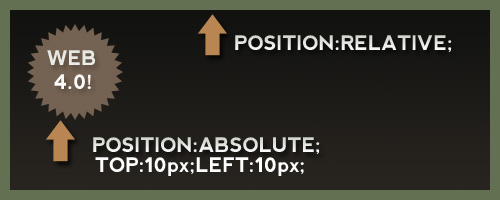
The main thing you need to keep in mind about the two, is that there is a huge advantage to using an absolutely positioned element inside a relatively positioned element. This allows you to create all kinds of cool layout techniques.
To further illustrate my point, have a look at this image I created for another CSS article a while back. I think it explains how things work when they are absolutely positioned inside a relative element:
How can it help?
One can argue it not only helps, but is vital to constructing a strong layout with elements positioned properly no matter screen size or resolution. Think about this scenario, you have a website with a div that is restricted to 960 pixels in width. You want to have a little website badge always be 10 pixels from the top and 10 pixels from the left of the parent div. SO you would set the parent div to relative and the badge to absolute. Then you can simply set the pixels and always have control of exactly where that badge is located relative to the position of the parent div.
If all that sounded too confusing, check out the links below where others perhaps explain it better than I can.
Where can I learn more?
8. Learn your font options!
Changing the font-family and font-size is all well and good, but did you know there are a ton of different typography techniques you can utilize with CSS?
For instance, I often see designers using all uppercase letters directly in the markup when they want to emphasize some text or the design calls for it. Why hardcode all caps? This is a style issue! The easy solution to this is to use the text-transform:uppercase property and change the style via CSS.
Do you know your other options for CSS typography and working with fonts? Quickly off the top of my head, here are some ideas:
- Letter spacing (letter-spacing:)
- Line height (line-height:)
- Word spacing (word-spacing:)
- Text decoration (text-decoration)
- Text indent (text-indent)
- First letter (:first-letter [pseudo property])
- First line (:first-line [pseudo property])
And that is just to name a few! Think about what you want your typography to reflect and look like and tweak it. Stop using the default line-height and letter-spacing and make your text really look good! Play around with it in firebug until you get it how you like it. The world is your burrito!
How can it help?
It can help by taking your website from an average and mediocre one, to one with brilliant and subtle typography. Small tweaks to font properties can really increase readability and usability for the end user.
Where can I learn more?
9. Create image sprites
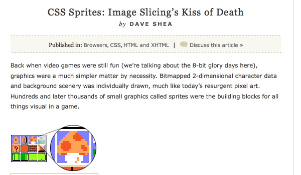
CSS Image sprites are a fantastic way to cut down on load times and add some really nice background image effects at the same time. Here is how image sprites work: you take a series of your background images, especially things like buttons, including their on and off hover states from your design. You mash up all of these images into one image and export the image. You then use the background property and positioning options to set different backgrounds on different elements with one image.
How can it help?
As mentioned, instead of 12 or more images, when you use image sprites, your using one image. Once the image has been loaded, you can call it as many times in your HTMl or CSS files you want, without having to download anything again.
Furthermore, using image sprites solves a common problem. If you have ever created a background image, that when hovered would show a different background image, you have probably noticed there is a slight glitch the first time you hover. By using and loading one image for all of our css background, we can successfully eliminate that minor flash/glitch.
Where can I learn more?
- A List Apart: CSS Image Sprites
- CSS Sprites: What they are, why they're cool, and how to use them.
- Image Sprite Navigation with CSS
10. Understand conditional comments
Though we may want to and sometimes even dream of it, there is really no avoiding internet explorer. Also, depending on the layout, IE is going to throw a fit over something you are trying to code or do. If it weren't for conditional comments and the ability to target and fix these issues, we would probably all quit our jobs and start selling beer out of the back of a van. Luckily, we aren't quite to that point yet.
Conditional comments are much like an if statement, if you have ever programmed, you will know what this means. It is a way of saying to the browser before the page loads, "Hey, if the browser is X, then download this CSS file too! kthxbye!". Using this knowledge we can import important script or CSS files only when the browser calls for it (I'm looking at you IE6!). For example, if we wanted to target IE7 and lower, we could simple add this to the head of our HTMl file:
<!--[if lte IE 7]>Import your script and CSS files for IE7 or lower here!<![endif]-->
We could also just target IE6 alone if we wanted to:
<!--[if IE 6]>IE6 only instructions here.<![endif]-->
Conditional comments only work with IE, which is sort of a blessing in a way, as that is usually one of the only browsers we need to target independently from others.
How can it help?
Whenever your stuck on a layout issue with IE only and no other browse, and you are going to have to call CSS or JS files to fix it, you should be using conditional comments. There is no need to load the extra info if the browser doesn't need it, and this is the exact functionality conditional comments provide us with.


Montana Flynn, 16 September, 2009
Opacitiy has changed since IE8 came into town, unless you want to force it to render in IE7 mode this is the new x-browser css:
.myclassname
{
filter: alpha(opacity:0.7);
KHTMLOpacity: 0.7;
MozOpacity: 0.7;
-khtml-opacity:.70;
-ms-filter:”alpha(opacity=70)”;
-moz-opacity:.70;
filter:alpha(opacity=70);
opacity:.70;
}
bc, 12 September, 2009
@grumpyoldman is full of shit, apparently, what with his eyes being filled with it. Ignore the troll. Good article. Frameworks are essential, and until you actually use one you won't understand how useful.
Agilius, 12 September, 2009
And you grumpy old man are a person with no life for wasting our time on your comment.
Nice article, I never tried the grid system but maybe some day I will :).
Grumpy Old Man, 11 September, 2009
Article sucks. Grid systems and CSS frameworks are for morons, the information about z-index is simply WRONG and the whole article has the visual appeal of a shit taken directly into one's eyes.